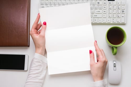
Creating a brochure to advertise your business, convey a message or cause, or simply provide further information on a topic is a great point of difference. Brochures can be created in many different shapes and sizes, and can either be simple or incredibly detailed. But what is the difference between a good brochure and a great brochure? And where should you start when it comes to the design?
We’ve put together a few tips to get you started.
Have an objective
Before you start, make sure you sit down and brainstorm what message it is you want to convey with your brochures. Are you aiming for serious or fun? Who is your target audience, and where will the brochures be placed? Remember that you have a limited number of words when it comes to a brochure, and the simpler the better when it comes to getting people’s attention. Think about colour schemes that might complement your business, and what style you might want to go for.
Keep it simple
Often businesses and students want to be creative with brochures – which is great, but lots of different fonts or colours can make it look too cluttered and untidy. To reach a wide audience, it’s best to stick with a simple style, one or two standard fonts, and a clear message. If you want to convey a few different things, think about dot points or multiple pages.
Make your paper choice
You’ve figured out your objective, and you have chosen a few styles and fonts to try out. Now, it’s time to choose your paper! It’s best to consult with an expert on the best type of paper for your budget and needs, but it’s also great to be armed with a few ideas. Think about how long you want your brochures to last (are they for a one-off event or advertising ongoing services?), and how durable they need to be. Do you want it to be glossy, basic, foldout?
Choose your target market
You may have already thought a little bit about your target market in step one; now that you’re at the design stage, it’s time to get more in-depth. If, for example, your brochures are related to medical check-ups or finance services, you’re likely to use simple basic colour schemes and not get too outlandish with the font and colours. If you’re advertising a fun run or marketing services, you may use more colour and keep the brochure to one page or a double-sided leaflet.
Photos and a sharp message
No matter what type of audience you’re looking to target, people generally respond best to imagery: photographs, clear font, big messages that they can’t miss. Think about what imagery might work with your brochure, and ensure that you keep your text short and sharp. You might even be directing potential clients back to a website for more information, or simply providing dates and details of an event. Keep your brochure simple, easy, and don’t forget your readers!
At A Team Printing we are passionate about providing quality printing services to our customers, contact us today to find out more about what we can do for you.

